UX design, ui design, ui development

MySky

In this final project for my UI Design Programming course at Seoul National University, I designed an app that aimed to reinvent the way users approach checking the weather. 

The goal is to simplify and personalize the weather-checking process, delivering essential, tailored information at a glance.

Timeline

March - April 2023 (1 month)

My role

Designer, Developer

Tools

Figma, VSCode, Github, Procreate

introduction

The Problem

For this project we were asked to reimagine a mundane digital task into a more joyful personal utility. The task I chose to tackle was my habit of checking the weather before getting ready for the day.

We often manually consider the weather every morning to make an appropriate outfit decision. This is the process my app aimed to customize and simplify.

The Solution

The goal was to create a fun weather app that streamlines the decision-making process by presenting a personalized verdict on the home screen, emphasizing key details and clothing recommendations. 

This would eliminate the need for users to sift through extra weather metrics, making the process more efficient and adding an element of joy to the mundane task of checking the weather.

Jump to prototype
Phase 1: Conceptualization

Research

I first studied weather apps such as Apple Weather and The Weather Channel to research the information architecture and user journey in similar existing experiences.

I also conducted a few interviews with friends to understand different weather app preferences. Here's some of the key feedback I received:

100%

of interviewees usually checked the weather before starting their day

50%

mentioned wanting to be able to access more detailed information such as data sources easily

75%

expressed a preference for a more visually interesting interface when asked what would make them change their preferred weather app

Ideation Process

1. Brainstorm

Based on research, rapidly brainstormed all kinds of features that would simplify the weather-checking process. 

2. Select

Narrowed down to features that worked best, and workshopped what the home screen’s personalized verdict would look like.

3. Refine

Considered secondary user goals such as customizing ideal conditions and accessing detailed weather information.

4. Site Map
Phase 2: Design

Sketching

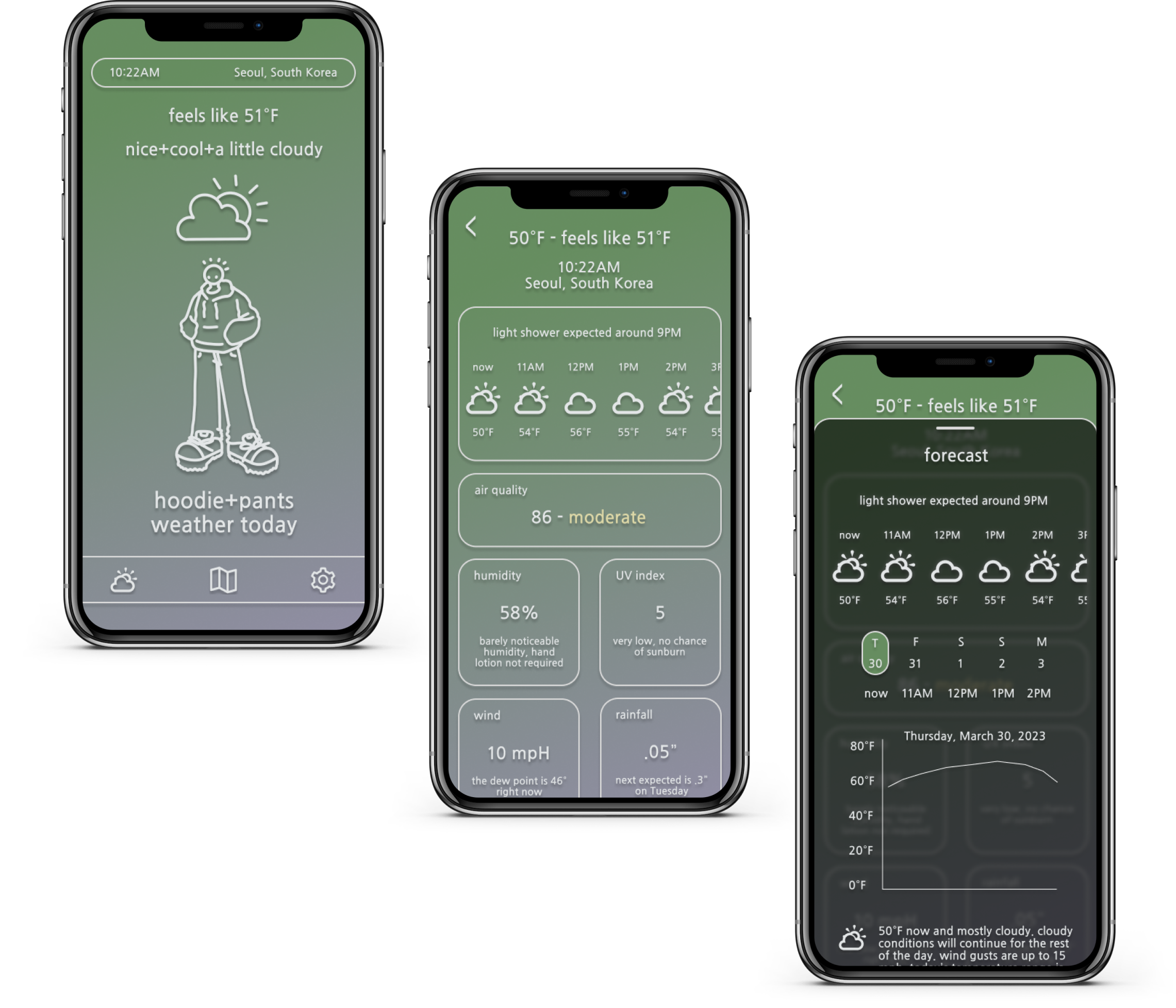
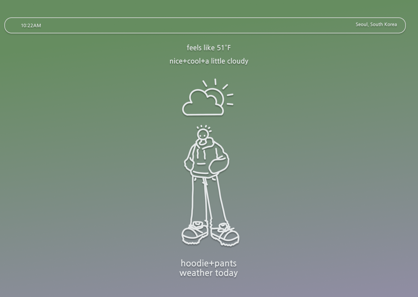
Based on this sitemap, I created some digital sketches to visualize the app's look and structure, emphasizing a clean design with a prominent personalized weather verdict. 

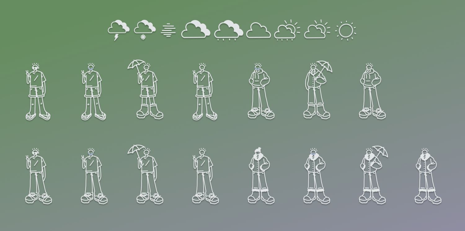
As I struggled to find available weather and outfit graphics to use on the home page, I decided to draw them myself to fit the niche requirements and craft a unique aesthetic.

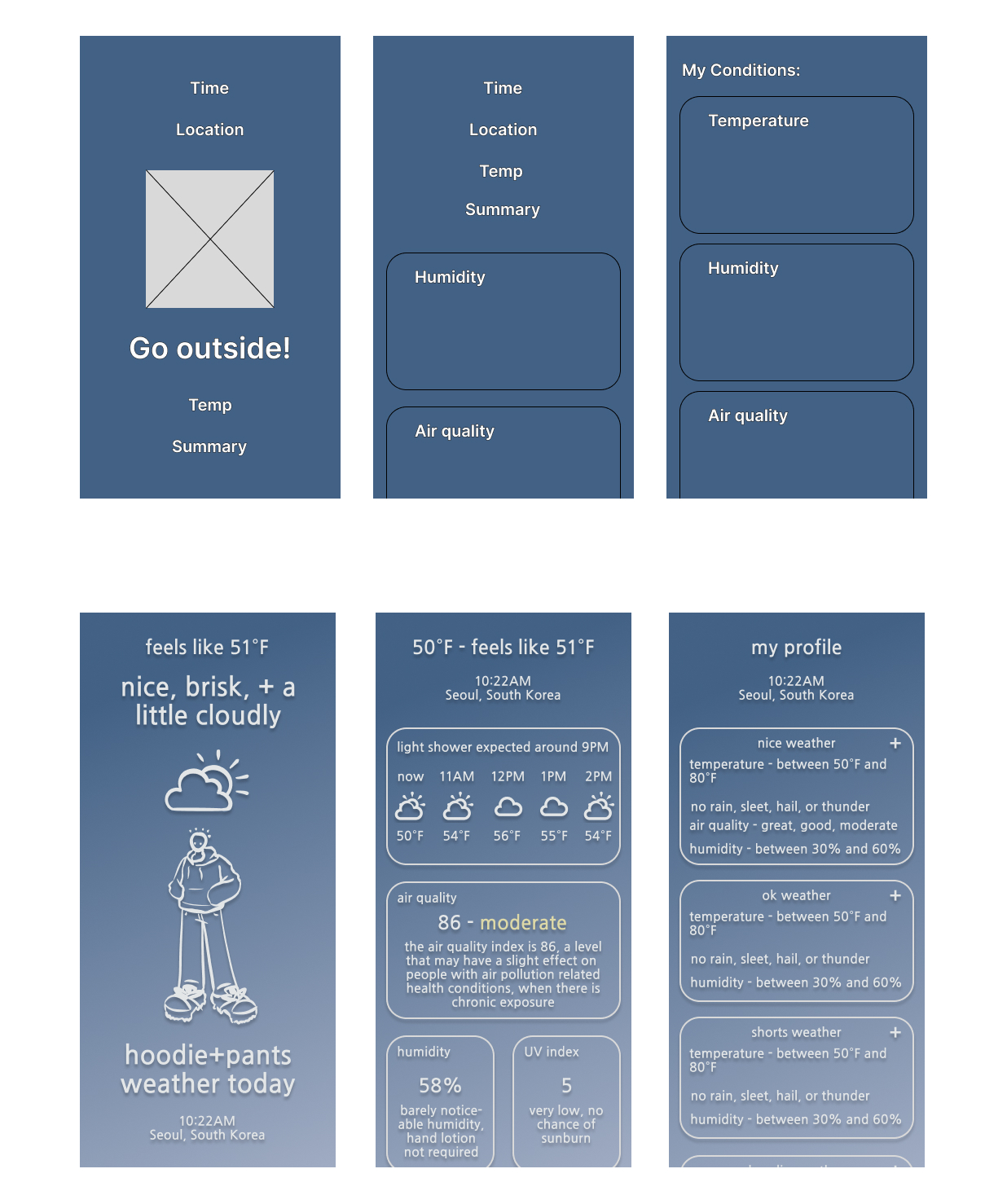
I presented this design draft to my peers and instructors, walking through how I envisioned the users would interact with the app. These were some of the key critiques I received:

Unclear Navigation

It's not intuitive to click on the character to access the profile, or the weather icon to access details.

Feature Suggestion

Some users may benefit from a map interface.

Color Encoding

Why were these colors chosen, and could they be used more intentionally?

Mid-Fidelity Wireframe

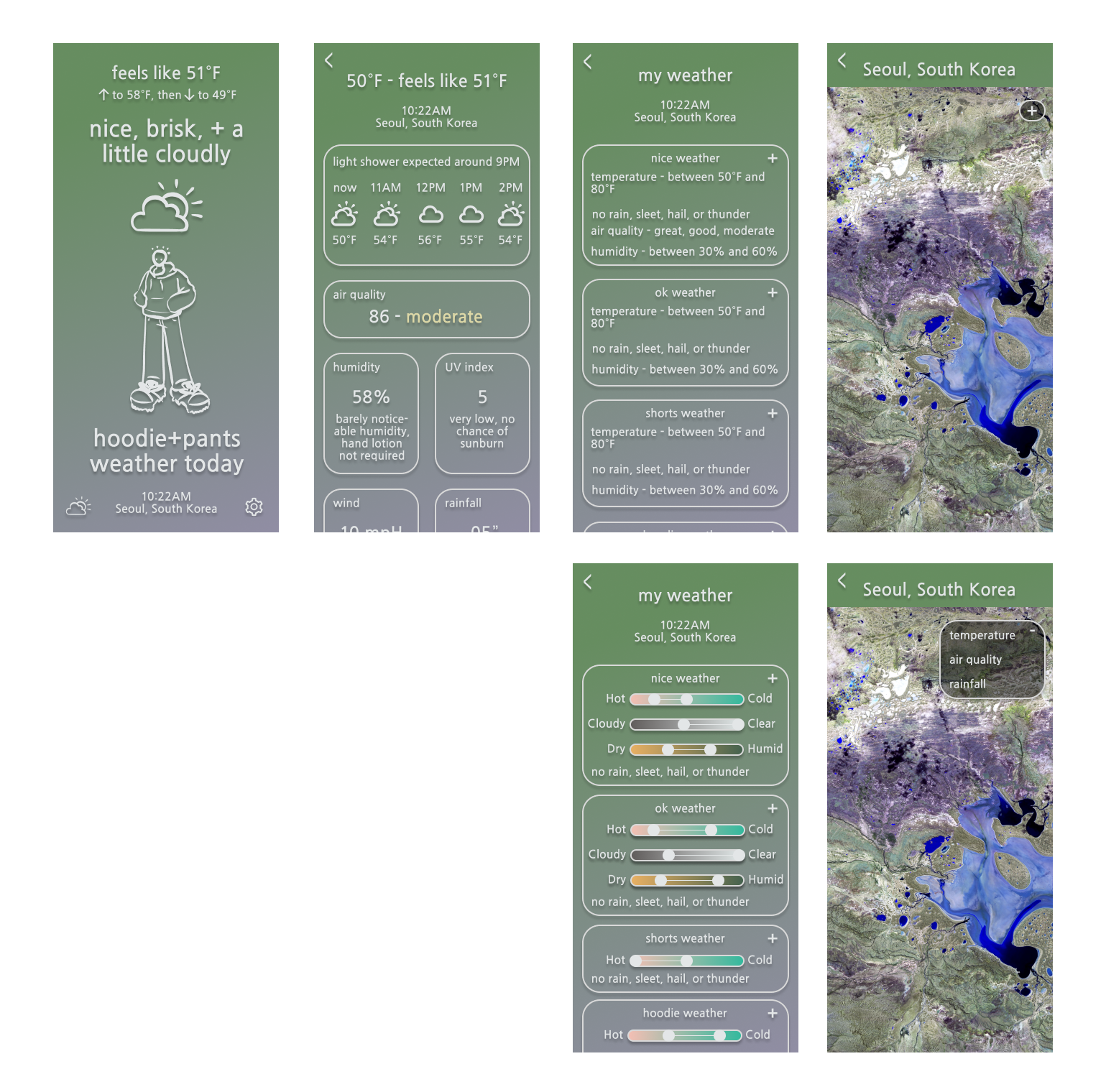
I addressed most of the feedback received on my rough draft in this iteration.

Color Encoding

I also developed a system of color encoding, to be used both in the sliding selectors on the settings page and to generate a weather-specific background gradient.
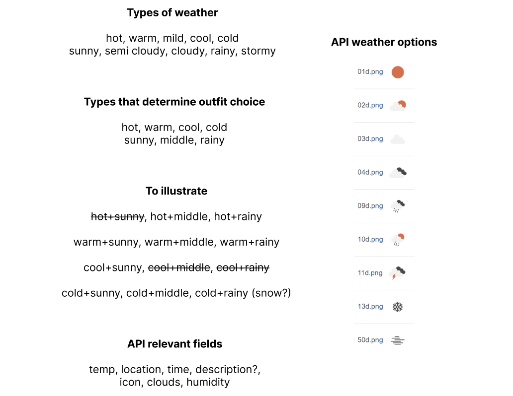
Phase 3: Prototyping

Figma Prototype

A final round of crit presentations helped me build this interactive prototype.

  • Home: The app's main screen displays essential information in a single view. It additionally offers an outfit recommendation based on today’s weather conditions, and displays different color gradient backgrounds that change dynamically based on the current weather conditions, adding a visual code to the forecast display.
  • Weather: For users seeking additional weather details such as humidity and wind speed, there is a dedicated screen that offers comprehensive weather information.
  • Settings: The settings screen allows users to customize their location and ideal weather conditions beyond the default settings. Not depicted are additional options to change character appearance, temperature measurement, and account information.
  • Map: The map screen provides a visual representation of the temperature, air quality, or rainfall patterns in the user's area.
Phase 4: Implementation

Functionality

As the final part of this project, we had a few days to turn our private utility into a publicly available single-page web site. 

Below is the API logic behind making the site functional and the corresponding illustrations I created.

Final Website

You can view the repository for this project here.

I used the OpenWeatherMap API to access weather data for the user's current location, and GitHub for versions and deployment.

Reflection

What I Learned

This social, iterative design process allowed me to incorporate valuable feedback from my peers and mentors to refine the interface. This practiced attention to the details of design choices was a reminder that user experience is not only about functionality but also about visual appeal and clarity.

Translating my design into a web page also allowed me to merge my interests in art and coding, and I especially enjoyed the puzzle of implementing the outfit recommendation feature. 

To conclude, this project was great practice in writing pure HTML/CSS, introduced me to new concepts such as mobile-first design and web-fonts, and inspired me to prioritize designing for joy and personal expression.